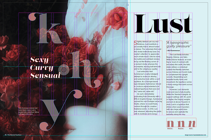
Lust Typography Spread
C- Mini Project 3: Typeface
Initial Research:
My first impression of the Lust typography was a mix of surprise and mystery. Just like the name “Lust,” its seductive, curly strokes immediately pulled my attention. I have never really seen such elaborate typeface before, especially the extreme contrast between the thick and thin strokes and razor sharp edges.
Typography basic info:

- Typeface is a particular design of type, whereas a font is a type in particular size and weight.
(Type Exercises!!)
Background of Typeface:

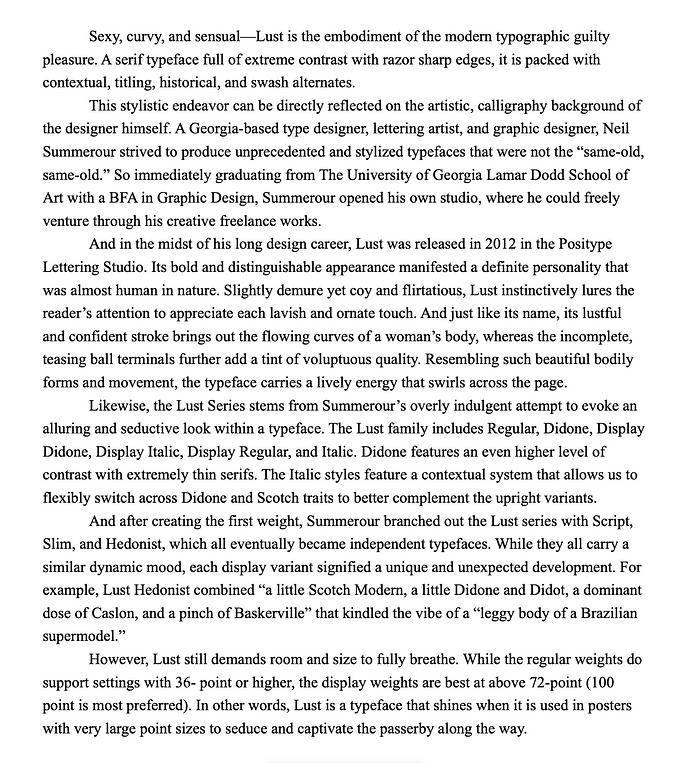
- Modern Serif font released in 2012 in the Positype Lettering Studio
- designed by Neil Summerour, a Georgia-based type designer, lettering artist, and graphic designer
- based off traditionally staid Scotches and Didones
- Lust family includes: Regular, Didone, Display Didone, Display Italic, Display Regular, and Italic.
- Lust Series include Script, Slim, and Hedonist
- While the regular weights do support settings with 36- point or higher, the display weights are best at above 72-point (100 point is most preferred).
Some adjectives..
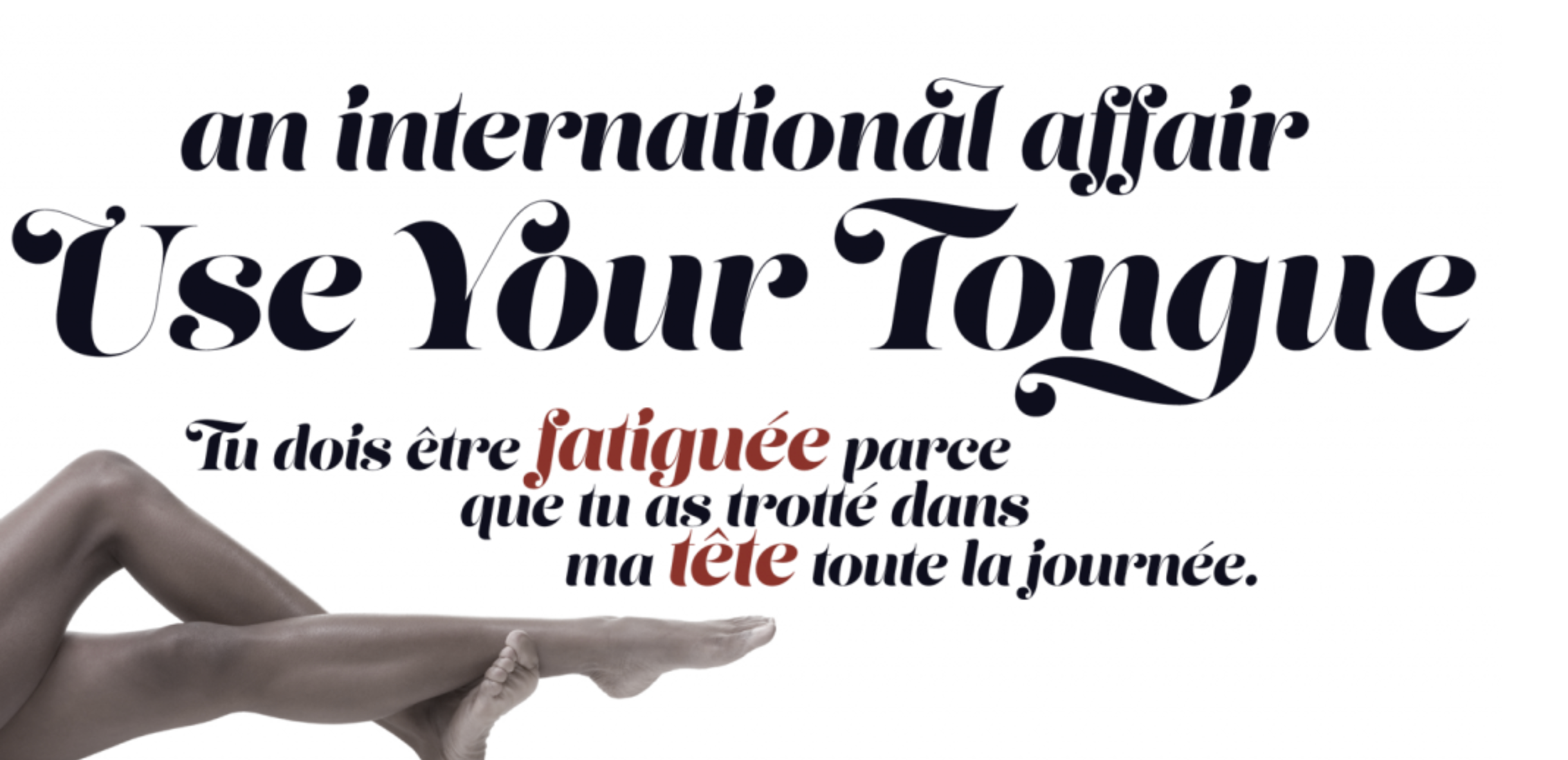
- Sexy, curvy, sensual, confident
- Has definitive personality — slightly demure yet coy and flirtatious
- a very sensual typeface that directly reflects Summerour’s calligraphic and artistic background
- lustful and confident stroke brings out the flowing curves of a woman’s body
- the incomplete, teasing ball terminals add a tint of voluptuous quality.


Some new vocabularies:
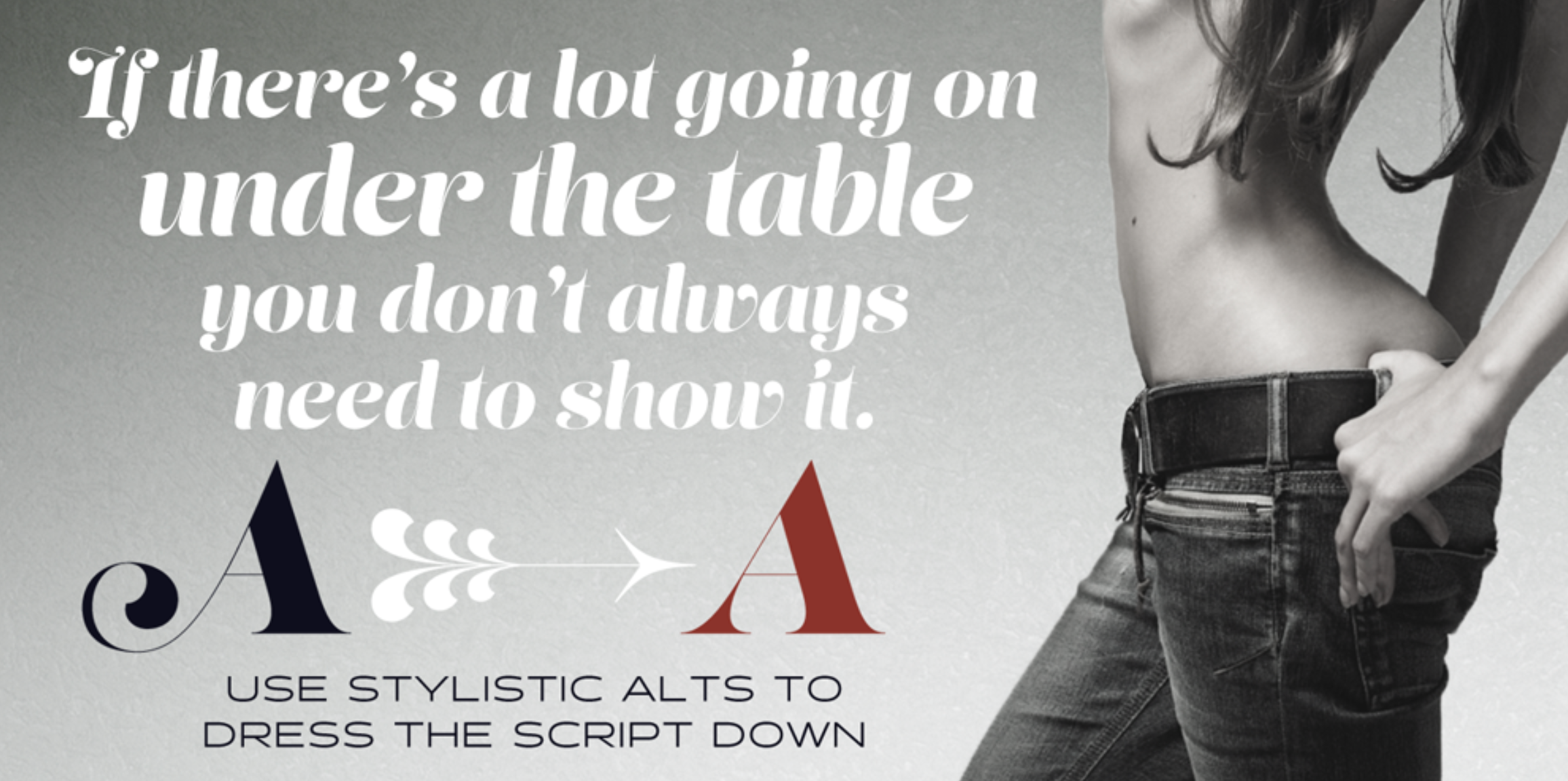
- Discretionary Ligatures: created when two or more letters are joined to create one glyph (decorative but should be used sparingly)
- Swash: decorative character that have a flourish or extended stroke (beginning or end of character), adding elegance and emphasis
- Titling Alternates: Specially- designed capitals intended for display usage (scale, proportion and design details are altered to look best at larger sizes)
- Contextual Alternates: next to specific characters to improve spacing or connections (found in script typefaces for more natural link between two characters to better imitate handwriting)
2. Typeface Essay
Along with designing the visual layout of the spread, I also had to produce the content, which was an analytical essay about my typeface. With this essay, I tried to really bring out the dynamic personality of Lust, emphasizing its sensual and sexy mood through careful choice of adjectives. As such the content is written below:
3. Finding Font Pairings
Since Lust is not an appropriate typeface to use for body text, I searched for a new San Serif font that would have enough contrast and provide readability at the same time. As such, I looked at some font pairing websites, where I explored Neuzeit Grotesk and Proxima Nova.


When printed out, point 10 size font was still pretty readable.
Exploring Images
I started by thinking about the kind of mood I wanted to portray “Lust.” Going back to the designer’s purpose (evoking the curves of the type), I wanted to integrate photos that expressed the beautiful and sensual look of a woman’s body. However, I still had to be cautious that the photos are not overly provocative as it could cause some discomfort.
I already had a few photographers that popped up in my mind from those who are known for their conceptual, artistic works to high fashion. I also looked in Pinterest and Splash to find more graphics that may signify lust, such as the orchids that symbolize feminine beauty, love, and strength.


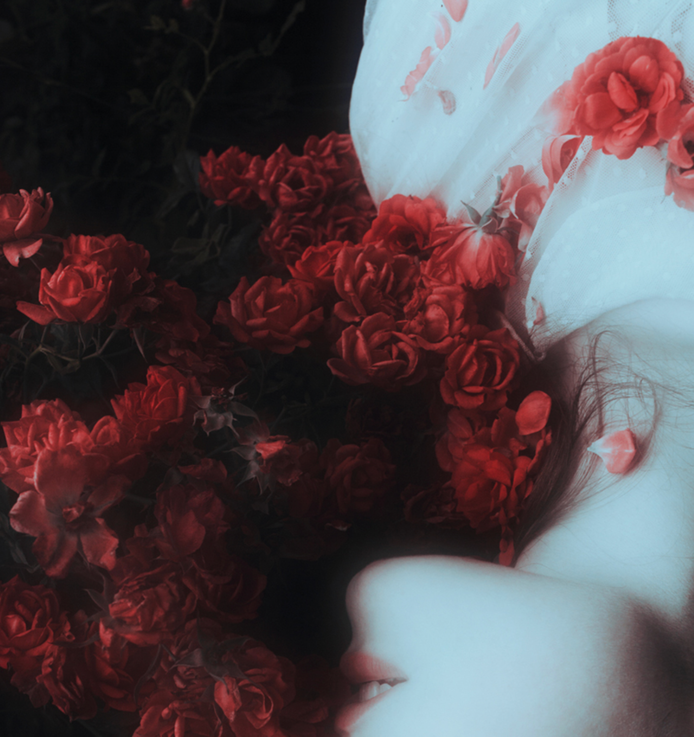
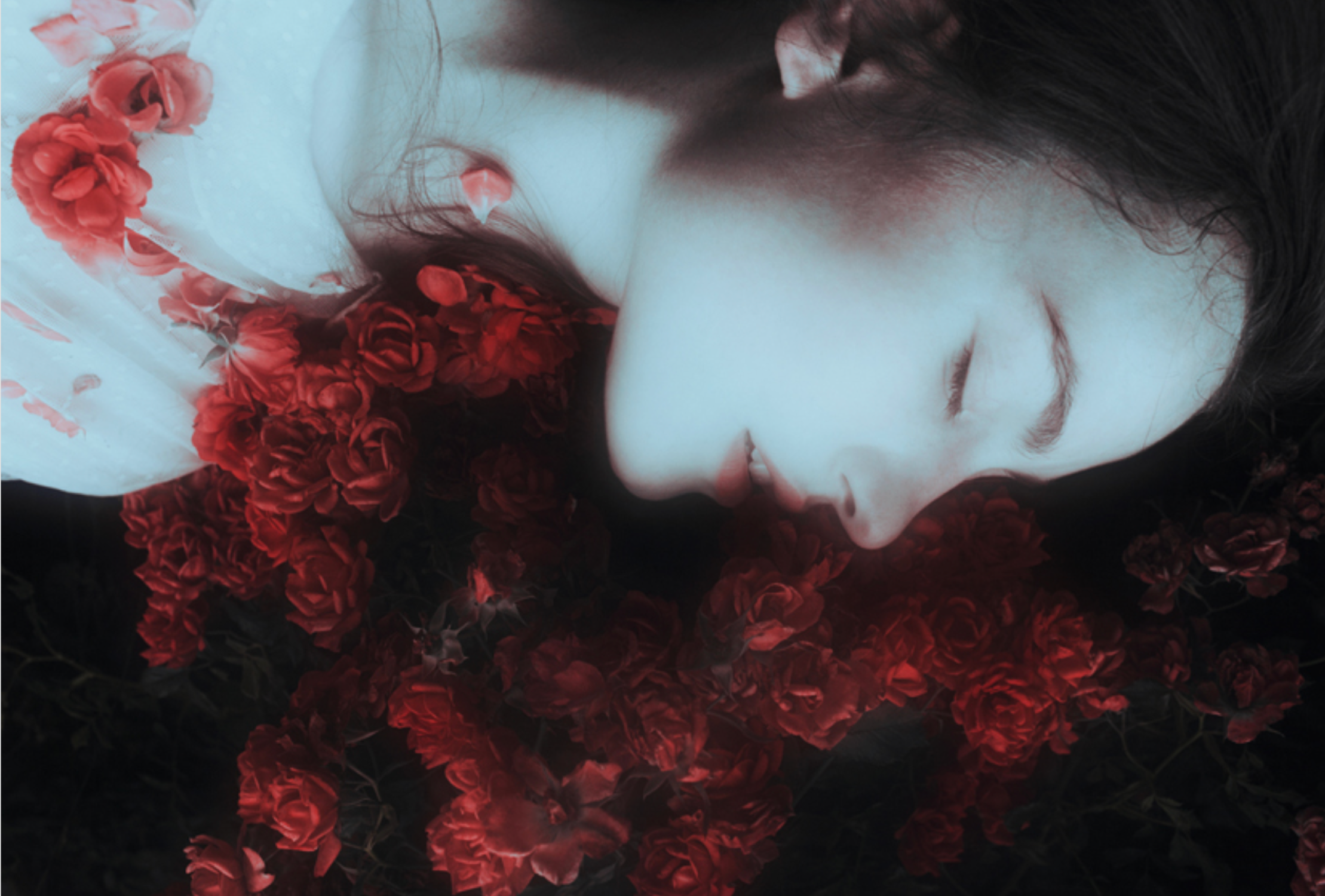
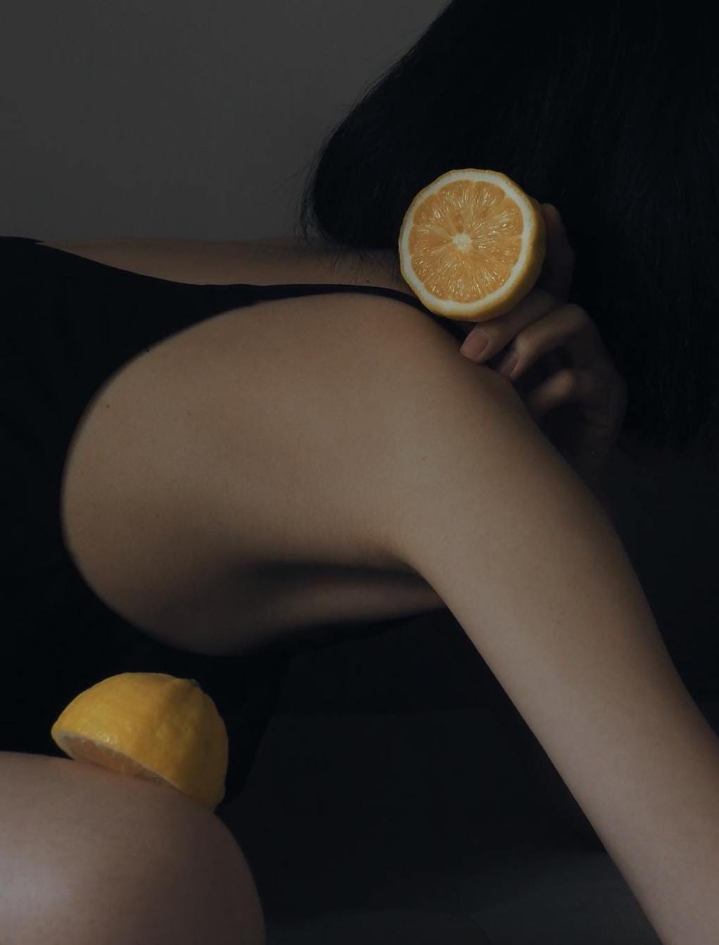

Among these photos, I was most attracted to the red rose photo with the girl lying down and the one with a finger touching the slice of orange. The vivid color of the red roses immediately set the romantic, alluring look that highly contrasted with the girl’s face. The orange slice photo also evoked a sensual mood though in a different way. The delicate lines of the arm and hand, as well as the contrasting shadow/lighting sparked my interest.
On the other hand, the high fashion Solve Sunsbo photographs were definitely striking, but I realized they might actually overpower the typography. The numerous shadow lines could provide a jarring look when combined with the curly, delicate Lust fonts and writing.
Initial Exploration
With my initial brainstormed layouts, I focused mainly on constructing text around the graphics:


Takeaway Feedbacks from Sherry
- Text hierarchy: “Lust” needs to be more emphasized than the quotes. Right now, there is too much on every page, making it challenging for the reader to know where to look first.
- The rectangular overlay behind text feels isolated compared to the image. The sharp bottom right corner also feels uncomfortable (the corner looks as if it’s piercing the woman’s neck)
- Risky to put text over graphics (Hard to read the white letters on top of the decorative graphics with all the roses)
- The small “Lust” title is not used appropriately (this typeface was created for big scale headers)
- Showing the bodily movements and curves of the Lust letters by integrating them within body photos work well
1st Draft Layouts


Among these 4 spreads, I personally felt that the most bottom spread (red roses photo) feels most appropriate as for now. The typeface “Lust” sparked immediate attention, then it directed the viewer’s eyes to the bottom “Y” analysis, and finally the right page. Currently both bottom spreads are all contained within the grid, creating a more stable and steady look compared to the ones above.
Main Critique Takeaways (10/1/19)
- Grid Structure: I stayed more passive in using the grid as I tried to structure my content mostly around the graphic image (around the face/neck of the girl). Also extending the image to the right page does support in characterizing the typeface.
- Readability of text: Most text are readable, but the body paragraphs are somewhat hard to distinguish from each other. Also, maybe there are too few words per line. (Try out different kerning and leading sizes/ spaces between paragraphs)
- Be careful of Widow/Orphan: Widow is a short line or a single word at the end of the paragraph (“old” in the 1st paragraph is orphan).
- Visual Hierarchy: While “Lust” and the analysis image immediately attract attention first, the intro paragraph does not stand out as much. I also got a few opinions that my very first intro draft paragraph grabs the reader’s attention more than my edited version. (Explore ways to emphasize my intro sentences)
- Principles of Design: The typeface and font of the body paragraphs seem a little too remote from Lust. Also, the subtext for analysis does not have enough contrast to clearly show that it is a blurb rather than a part of the body text.
- *Lab tips: Saving images not as screenshots (RGB mode) but as jpeg or png.
2nd Revision
For the 2nd drafts, I added another element “Sexy, curvy, sensual” as the hook phrase. However, adding a new element caused a new problem—now the spread felt overloaded with too many screaming text. It’s hard to visually go through the layout and decide where to look first and next.


- “Lust” and “A typographic guilty pleasure” are competing, along with the scattered letters around the graphic
- Making the left and right pages feel more cohesive together—How can I continue the graceful and lovely mood from the graphic to the right?
- Also, start focusing into the micro details—the right column text still has orphans and the kerning could also be adjusted.
2nd Draft
After continuous iterations, I tried something completely different. Rather than having “Lust” on the left page, I moved it over to the right; the thick black Lust provided stark contrast to the left italicized words and fancy alternates, and I also liked how the four letters fit tightly within the grids. “Sexy, Curvy, Sensual” looked more desirable when it became the focus within the image surrounded by the romantic letterings.

Main Critique Takeaways (10/3/19)
- Fixing the quotation “Neil Summerour”
- Removing the “N” samples on the right corner (they did not really add much depth into the text)
- Making the sizes of the alphabets on the right bigger than “Lust” on the right
- Try to make the right body text boxes equal (work around orphans by changing the kerning or even adding new words)
- Fix the page and image source text on the bottom to stay within the pages more.
Final Poster

